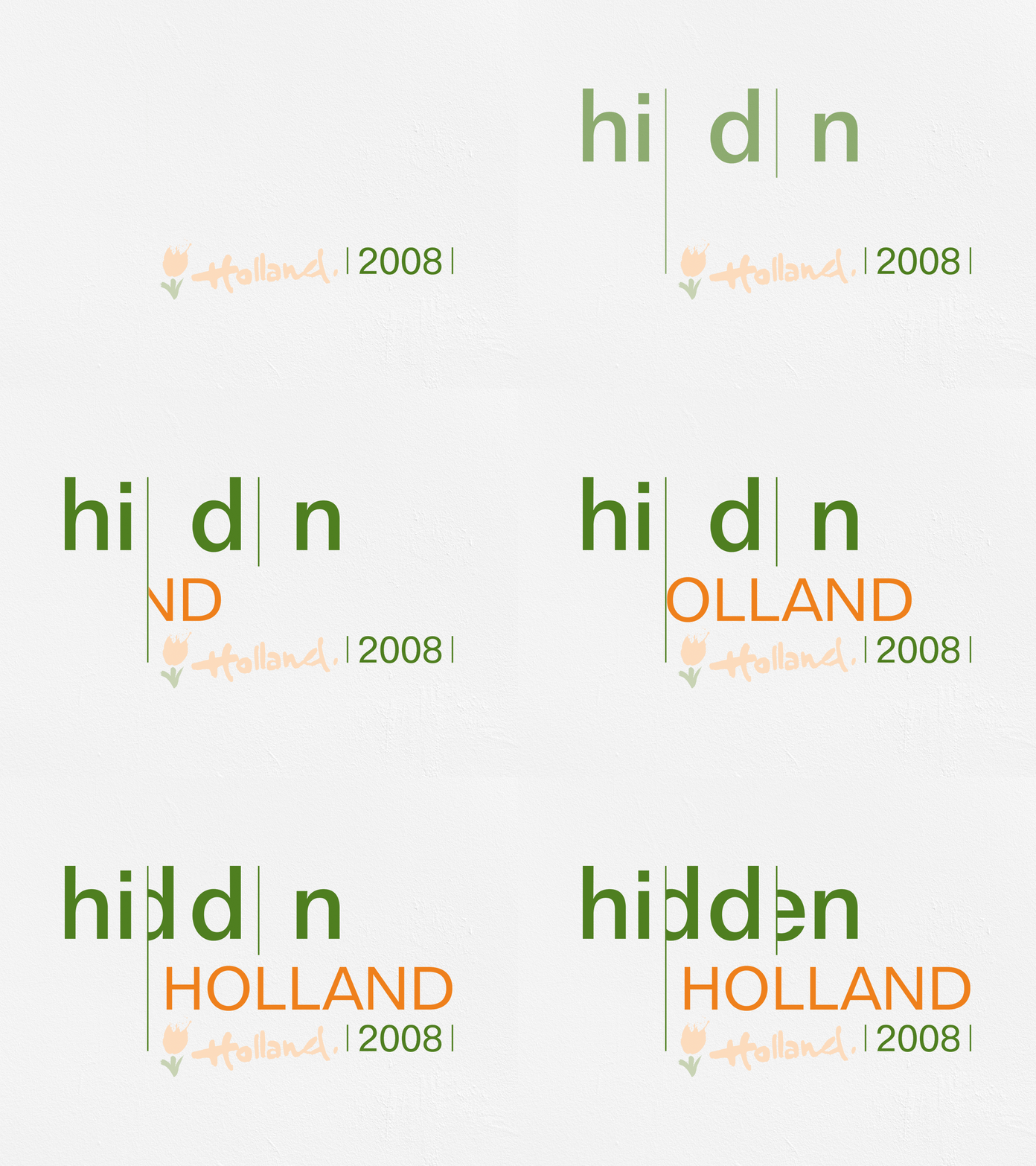
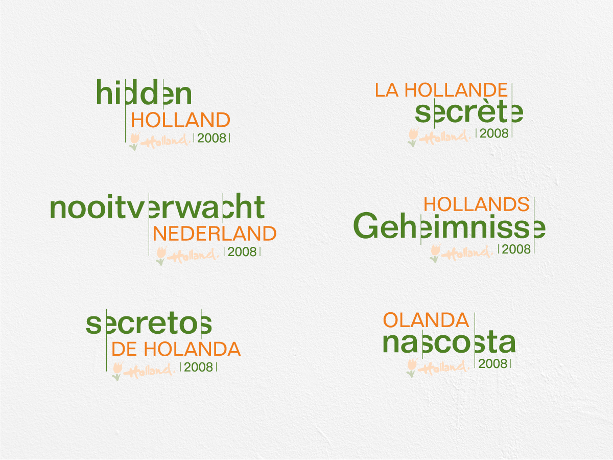
Followed by Hidden Holland in 2008, revealing hidden spots throughout the Netherlands. I designed a typo logo with some of the letters hidden behind a line, emphasising the hidden spots. This idea was further elaborated in the animations that became widespread on the internet.
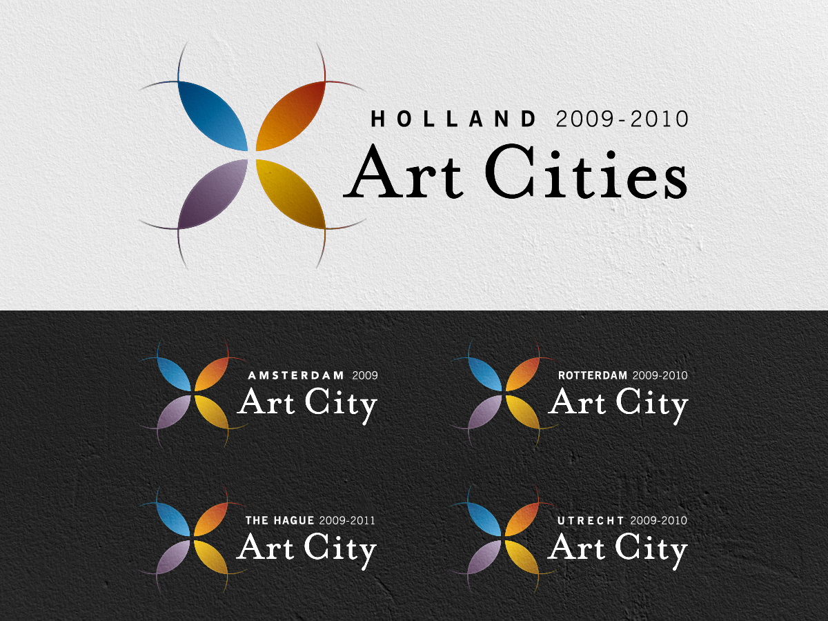
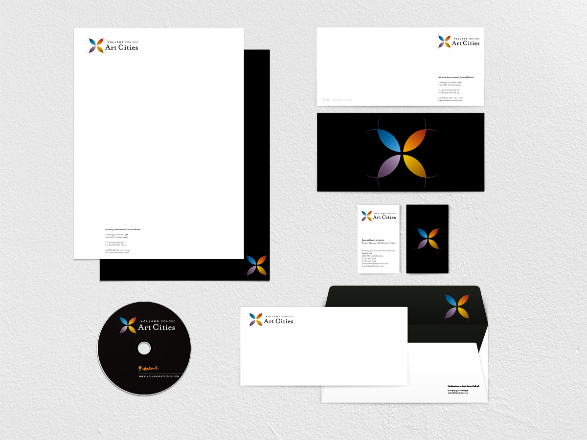
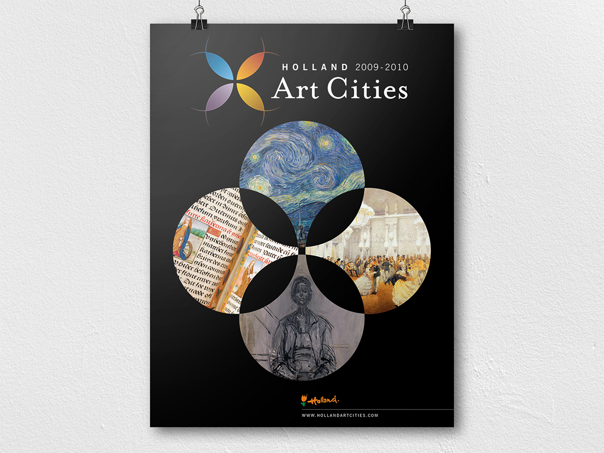
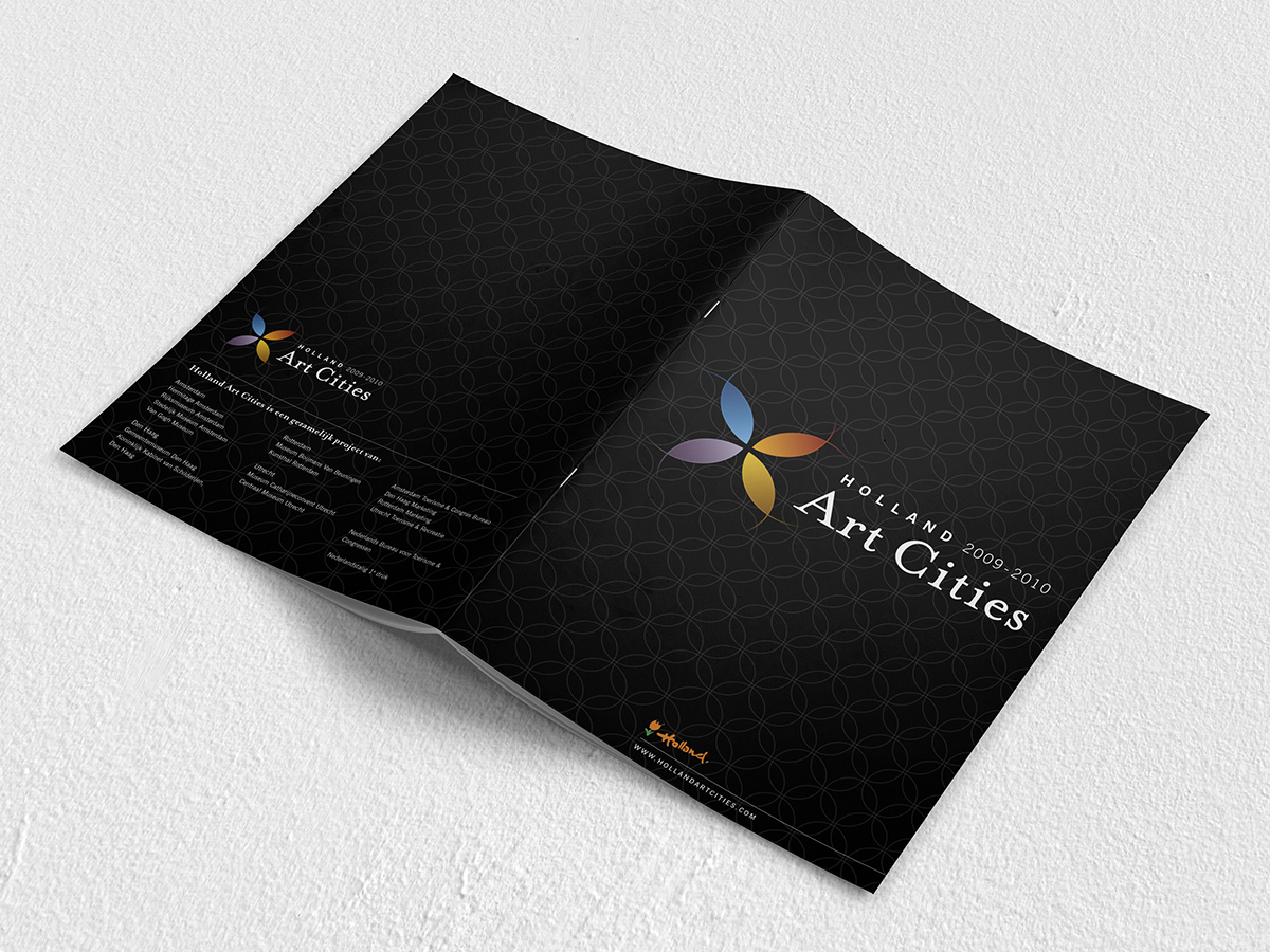
And finishing with Holland Art Cities 2009-2010, an art collaboration between the 4 cities Amsterdam, Rotterdam, The Hague & Utrecht. In the logo I designed you can see 4 circles referring to the 4 cities. Using colours where the 4 circles overlapped each other, using lines to emphasize the 4 circles. The circle concept was further elaborated in the animations that became widespread on the internet.
