- CLIENTDordrecht Marketing
- INDUSTRYCity Marketing
- SERVICESCorporate, Interface & Web Design
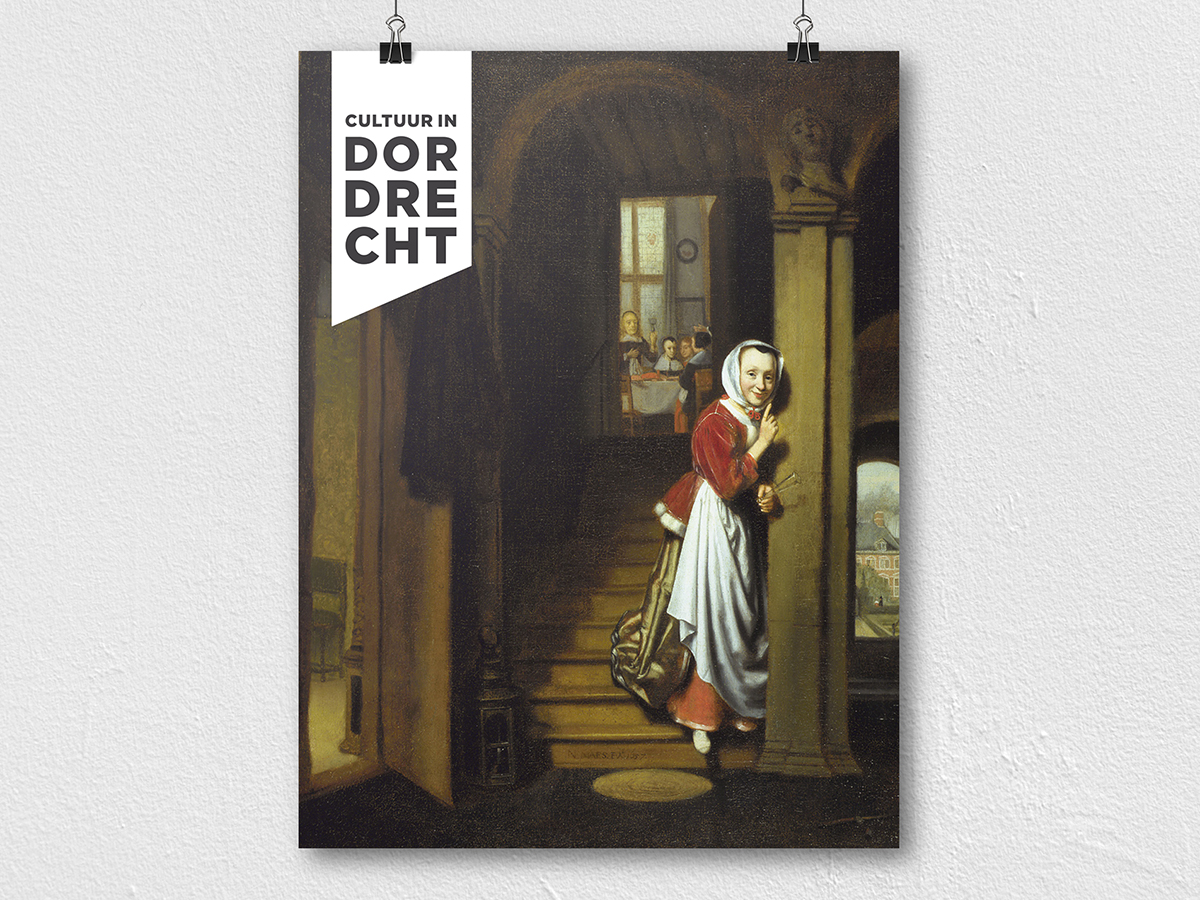
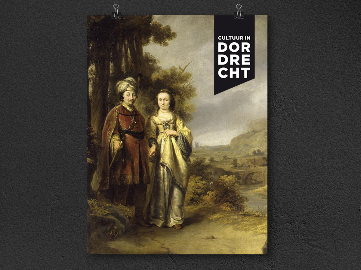
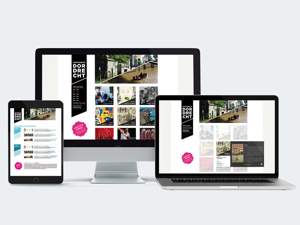
For Dordrecht Marketing, I designed a logo that should come on all cultural communication activities in Dordrecht. From Kunstmin to Deep.
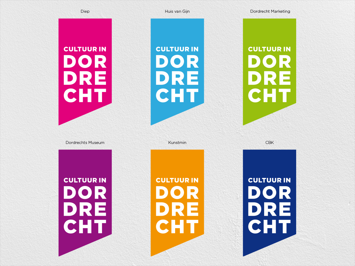
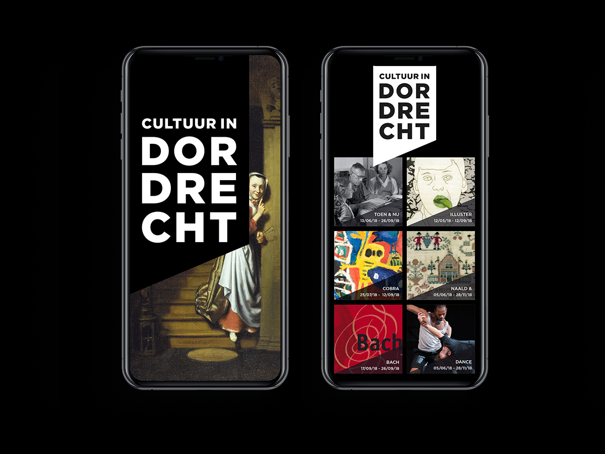
Inspired by the Wingclip shape, I designed a ‘stacked typo logo’, recognizable at a glance and always positioned at the top. Every cultural organization received a special color. For the app and website which I designed, I applied the recognizable angle to photos and textual information.
